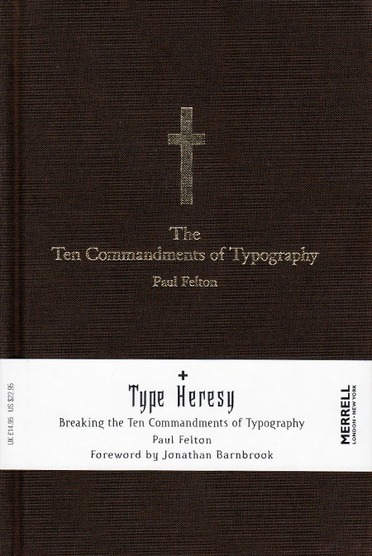


A humorous and incisive analysis of the basic tenets of typography and how to turn them on their heads, this book will appeal to the conformist and the non-conformist in everyone – not just the newcomer to design. One side of this sharp-witted, cleverly designed guide presents the ten main rules, or ‘commandments’, of type design, addressing such aspects of typographic doctrine as legibility, alignment and capitalization; the other shows how type can successfully subvert these rules, presenting ‘sacreligious’ visual alternatives. In support of the commandments Felton includes a list of twelve ‘disciples’, those internationally renowned graphic designers whom he identifies as rule-abiding, including such figures as Eric Gill, Jan Tschichold and Erik Spiekermann. Confronting these are his ‘fallen angels’, including such experimental typographers as David Carson, Jeffery Keedy, Phil Baines and Jonathan Barnbrook.
About the Author
Paul Felton is a graphic designer specializing in typography. In 2005 he won a D&AD Best New Blood Award for this book and for his recent design work.
Jonathan Barnbrook is one of the most influential graphic designers working today, whose experimental approach to typography has changed the face of font design.

